Implementing accessible views on iOS/SwiftUI
These days I was working on making the iOS application complaint to the new EU regulations for accessibility. With a proper auditory of the app, it is rather easy to implement a better accessibility.
However I must say, until this momentm I did not find ANY testing framework that actually covers accessibility as it is required by law.
We have AccessibilitySnapshot that is very limited, we also have ViewInspector which you can try to guarantee certain attributes. But I couldn’t find a framework that would tell me: hey you are not doing it right, group these elements, this and that should have a different accessibilityTrait etc. (In fact there is one, but I am not mentioning because it relies on ui-test and on top of that it did not find any really useful issue).
Getting Started
This is not a tutorial, it is simply the findings I had after doing several tasks related to accessibility.
You’ll have to be familiar with Accessibility Inspector tool that is available on Xcode. So let’s start with that.
Accessibility Inspector
This is a tool that comes with XCode.
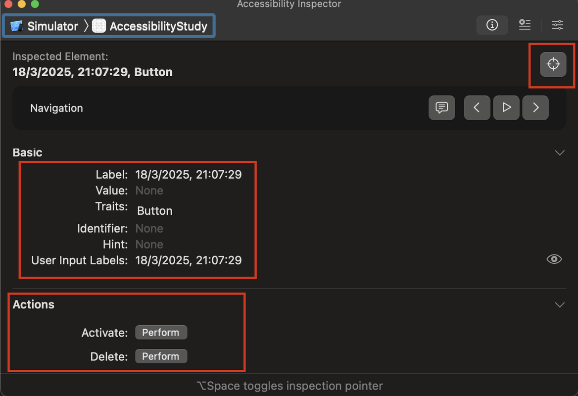
In a way, similar to Xcode, you have the target which you can select. From my experience, a bit buggy. If you are using the simulator you can both use the mac target or the simulator. It may change what is available as actions, since in one you are simulating using a computer and the other a phone.
Then we have a target ( ), which you can use to inspect a view. (Also a bit buggy so be patient when using it with a complex view hierarchy).
The basics display the selected element accessibility attributes, such as label (what the voice over will read), the traits (how it will be interpreted), identifier (hidden from the user, but useful for ui-tests)
The actions are the possible actions that can be executed from this accessible element. You have default actions, such as activate, but also you can add custom actions to it, such as the delete.
There are other sections, but they are not that useful, they are more informational.
Traits
Traits are useful information for the user to understand the context of the screen. A common trait that is often missing and adds context of section header is the “isHeader”.
Text("Title")
  .font(.largeTitle)
  .bold()
  .accessibilityAddTraits(.isHeader)
Another trait that I faced was “isLink”. It often comes that you have terms and conditions that are linked to the webview for more details. They are not really a button.
Text("Terms and conditions ....")
  .font(.caption)
  .tapGesture { openTermsConditions() }
  .accessibilityAddTraits(.isLink)
And finally the last one that is often asked is the isButton. This one comes out of the box if you are using SwiftUI.Button, however if you have made your own custom button implementation, then you need to add this trait.
Text(title)
  .font(.headline)
  .foregroundColor(.white)
  .padding()
  .background(Color.blue)
  .cornerRadius(8)
  .onTapGesture { action() }
  .accessibilityAddTraits(.isButton)
Grouping elements or hiding it
Another common complain is that elements that are related to each other should be grouped. For example, if you have a Card container that has several labels/buttons with information, they all should be grouped into the parent (Card) and be treated as a single element.
Let’s imagine the following view with title/subtitle, image and a button for an action.
struct ContentView: View {
    var body: some View {
        VStack(alignment: .leading, spacing: 10) {
            HStack {
                Image(systemName: "star.fill")
                    .foregroundColor(.yellow)
                VStack {
                    Text("Title")
                        .font(.largeTitle)
                        .bold()
                        .accessibilityAddTraits(.isHeader)

                    Text("Subtitle")
                        .font(.subheadline)
                }
            }

            Button(action: {
                // Button action here
            }) {
                Text("Press Me")
                    .padding()
                    .background(Color.blue)
                    .foregroundColor(.white)
                    .cornerRadius(8)
            }
        }
        .padding()
    }
}
There are two problems here, one if the image is relevant then it should have an accessibility label and second the user has to read one element at time.
The solution is rather simple:
VStack(alignment: .leading, spacing: 10) {
    Image(systemName: "star.fill")
        .foregroundColor(.yellow)
        .accessibilityLabel("Starred content")
    ...
}
.padding()
.accessibilityElement(children: .combine)
The .combine will make the voice reader to read all elements at once, one after another.
accessibilityAction
The accessibilityAction function in iOS Swift is used to define custom accessibility actions for UI elements, improving the app’s usability for VoiceOver and Switch Control users. It allows developers to add specific actions that assistive technologies can recognize and execute, beyond the default interactions like tapping or swiping. You should use accessibilityAction when you need to provide alternative or additional functionality for users with accessibility needs, such as marking an item as “favorite” or navigating to a different section. This function enhances accessibility by ensuring that all users, including those with disabilities, can fully interact with the app’s features.
Button(action: {
    viewModel.action()
}) {
    Text("Press Me")
        .padding()
        .background(Color.blue)
        .foregroundColor(.white)
        .cornerRadius(8)
}
.accessibilityAction {
    viewModel.action()
}
And remember, since you are using .combine strategy, it will also combine all actions.
Announcement
The AccessibilityNotification.Announcement().post function in iOS Swift is used to send accessibility announcements to VoiceOver users. It allows developers to notify assistive technologies about important changes in the app’s UI that may not be automatically detected, such as dynamic content updates or status changes (e.g., “Download completed” or “Error occurred”). You should use this function when critical information needs to be conveyed to users relying on VoiceOver, ensuring they are aware of updates that might not be visually apparent. This improves accessibility by making real-time updates more inclusive and user-friendly.
var highPriorityAnnouncement = AttributedString("Email address is invalid")
highPriorityAnnouncement.accessibilitySpeechAnnouncementPriority = .high
AccessibilityNotification.Announcement(highPriorityAnnouncement).post()
Reflection of the day
If you could put everything you’ve learned in your career on a paper how long would it take? It is easier to do little snippets every day when you learn something new…
Music
I remember playing this music on Guitar Hero …. good old times.